Overhauling My Website
In sophomore year of high school, I built my personal website from scratch. Why? I think it’s nice to have your own corner on the internet. This was the first project where I created a plan and followed through. At the time, it looked amazing.
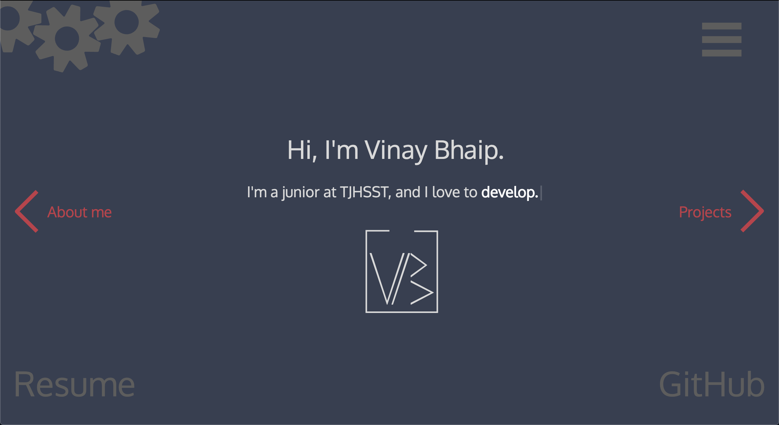 The first version of this website. Check it out here.
The problem - time fractures our perspectives. To my current set of eyes, this website looks - to be quite frank - bland, uninformative, and disappointing.
Goals
If I wanted to rebuild this website, the first step would be identifying what made it so bad. So I hit the whiteboard:
- The theme colors were dull. Grey, navy, white, and red just don’t stick out. Like c’mon 2017 Vinay, show your personality a bit more.
- There was no information about who I was. All the website said was that I liked coding and machine learning - nothing that’s unique.
- The cool features of the website didn’t even work! The website you see above had animated gears rotating, the arrows floating, and a sick logo animation - none of it worked anymore. (I had used Spirit while it was in beta, but now it required a subscription I did not want to pay).
- There was no way to contact me. I had intended to have a contact form when designing the website, but I kept putting it off.
- Everything felt clunky and straight-up wrong. It wasn’t true to who I was. The font I used felt generic and the buttons were large and childish.
In sum: 🤢.
Given everything I didn’t like, I wrote out what I wanted for version 2.0:
- Simple, elegant, and uniquely me
- Blog (Why? See here)
- Responsive design (should look nice on your phone)
- Contact me page
- Showcase my design and development skills
- Custom domain
The objectives for this were a bit broad, but at least I had more concrete goals.
Prototyping
As with all websites I make, I designed some mockups using Affinity Designer.
 The first version of the website that I mocked up. Keep in mind this is only the front page, and there would be more below.
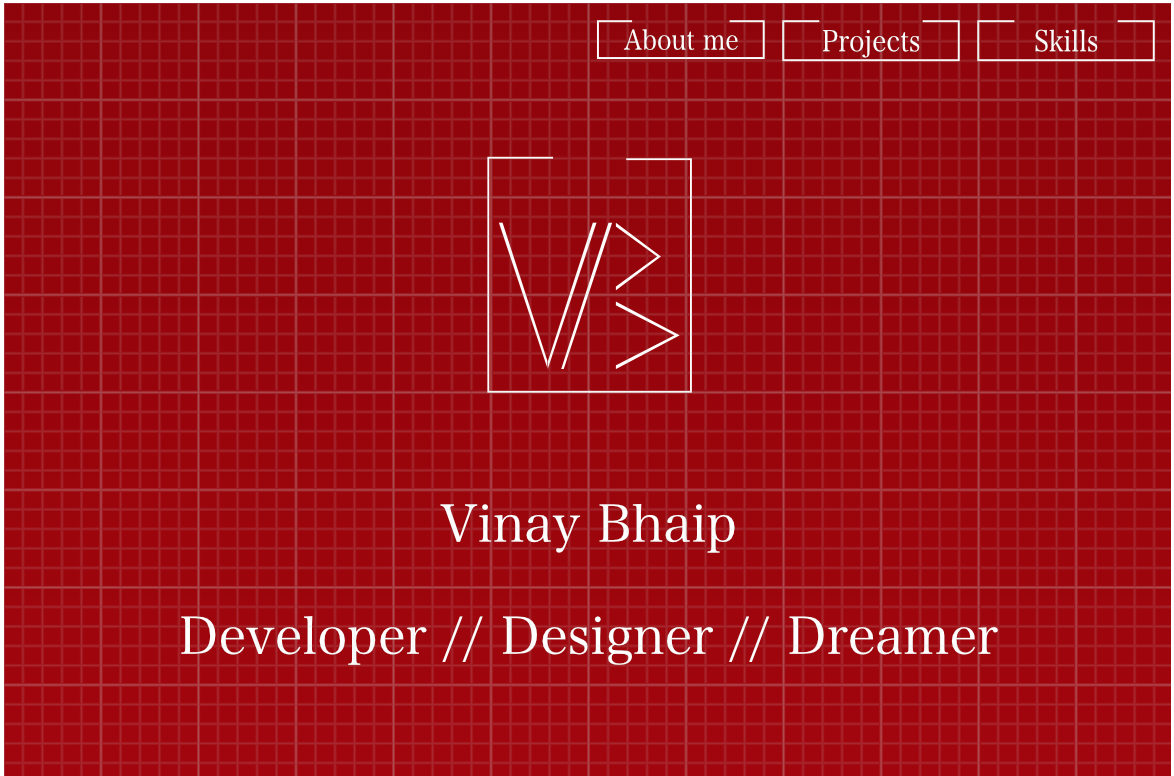
I created this mockup about a year before I came up with the objectives for my website, hence the lackluster. To be honest, this might be worse than the first version of the website. Words that come to mind: dull, boring, clichéd. “Developer, Designer, Dreamer” sounds so unoriginal and conveys nothing.
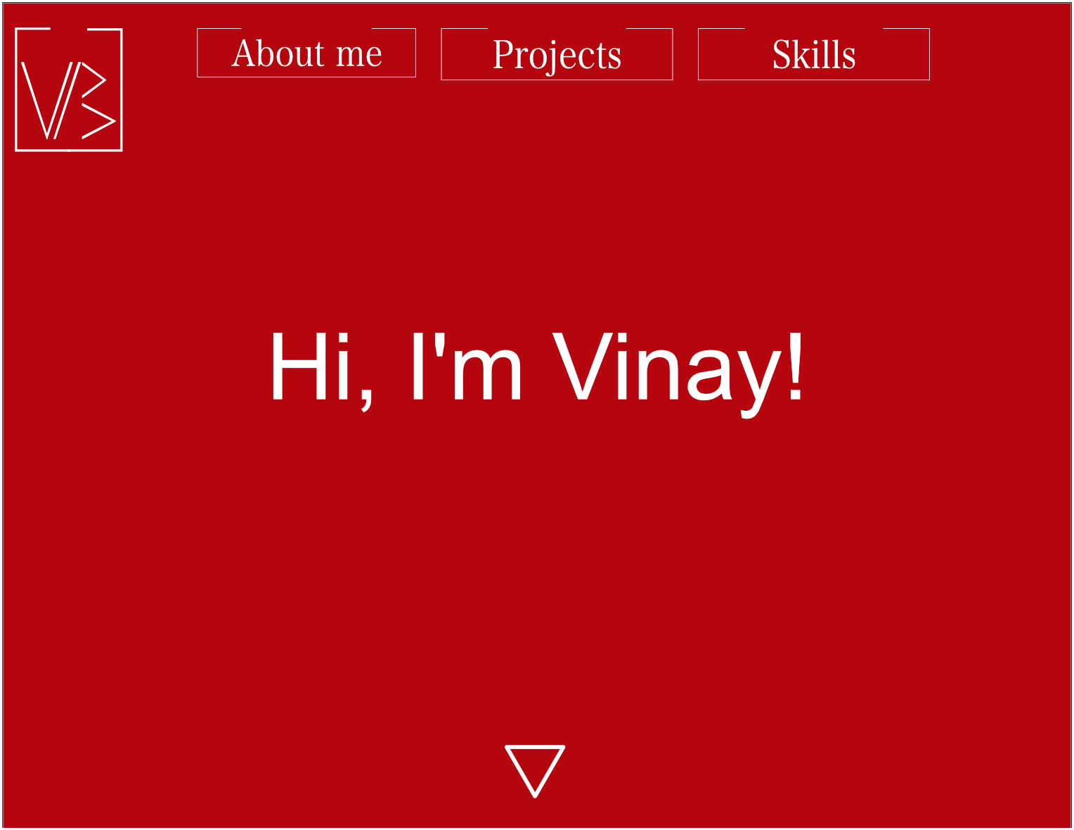 The second version of the website that I mocked up.
Again, I don’t really see any improvement. The font choice makes me wince. I’m glad I never actually made these mockups. While it’s marginally better than the previous version, it somehow conveys even less information.
These designs were bad, no sugar-coating it. If attach my name to anything, it should be high-quality. At this point I stepped aside and came back a year later once I came up with the concrete objectives above.
I also did more research to gain some inspiration online: personal favorites include Rafael Caferati’s website and Daniel Autry’s website.
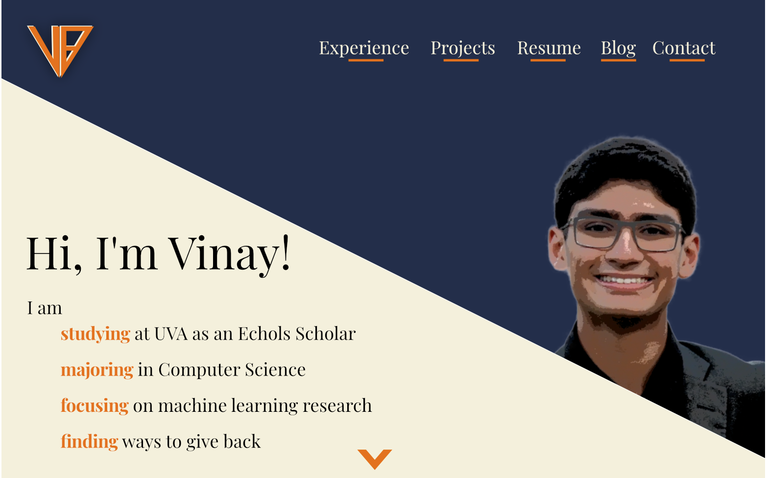 The third version of the website that I mocked up. It’s actually looking good now!
I don’t know about you but it is not an understatement to say this is miles better. And look! It actually shows my face and has a pleasing color palette. It’s amazing to see how much I’ve improved in a year.
Breaking down some of the design choices: First, it uses a diagonal line to create a juxtaposition between two colors. I like this because visually it pops out more and creates a clear division between the menu and a description of me. I also love how I show who I am, more than just a “developer.” The logo in the top-left corner is also completely different from before, but how I got there is a story for another day. The color scheme is a tribute to the next chapter of my life (go Hoos!).
And this was only the front page. After some tweaking here and there, I was ready to materialize my vision.
Development
I built the website as a static web page so I could host it on Github Pages. Slowly but steadily, everything came together: first the backbone, then some nice animations to liven the website. I tried avoiding external dependencies that might not work years down the line to keep the website “future-proof.”
After about a week or so of tinkering, I was done! You can check out the whole website at https://vinaybhaip.com. I’m pretty proud of how it all turned out (and it’s pretty close to the mockup!).
After creating this website, I bought my domain through Google Domains and linked it up to https://vbhaip.github.io. I chose to host on Github instead of another host like GoDaddy to minimize my costs (and because all the services other hosts marketed seemed to drive the price up - with Google Domains it was pretty clear cut).
If I could go back in time and change one thing about the design, it reluctantly would be the diagonals I used. Turns out formatting items with steep diagonals is hard, especially for smaller devices like phones. While I think they look amazing, I think the cost-benefit tradeoff for the two diagonals I used in the website is questionable.
Final Thoughts
When I made this website a few years ago, I was extremely proud, as I should’ve been - I worked super hard. After some time this pride shifted to cringe - was this the best work I did? I think it’s good to cringe at your former self - it’s a sign that I’ve grown in my aesthetic, development skills, and more broadly my beliefs.
If I don’t cringe at my past self and want to improve, that’s a problem.
So in a couple of years, don’t be surprised if this website changes. It’s just me growing.