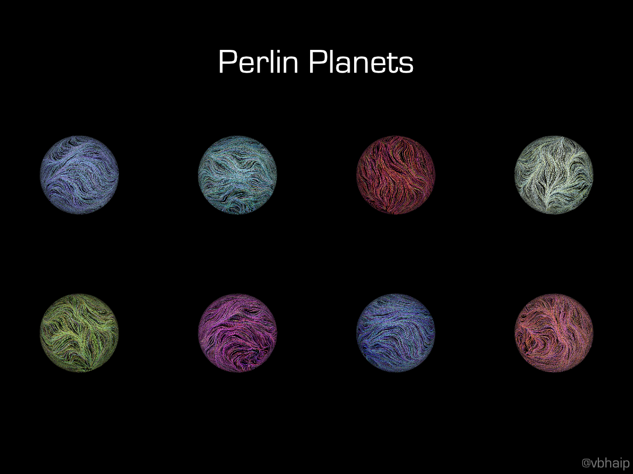
Perlin Planets
An example of a Perlin planet. Hover over/tap the image to see it in action. Keep in mind these GIFs are large if you are on data.
Background
I came across this cool blog post from Atul Vinayak on what they call “noise planets.” I recommend checking out the post, but basically they created generative art to replicate art from Tyler Hobbs. The way to generate this is to make flow fields using Perlin noise, which I found incredibly fascinating. The post was pretty popular on Hacker News, but I noticed one of the comments said it was more like noise circles, rather than noise spheres. I decided to fix that.
Making Perlin Planets
The first step was replicating the work from the aforementioned blog post. I won’t go into that here because the blog post already does a great job. The main changes I made were making the edges of the circle have less opacity and reducing the stroke width at the edges to give the illusion of depth.
My first attempt at a Perlin planet. Remember to click it to see the GIF and that it may take a few seconds to load.
Looks cool! It was a bit more like a planet, but it wasn’t great. If I really wanted to make it planet-esque, I’d have to take the Perlin noise and put it on an actual sphere.
To do this, I intuitively generated random points on the sphere shell by sampling $\phi \in [0, \pi)$ and $\theta \in [0, 2\pi)$ (foreshadow: my intuition was wrong). Then, I used 2D Perlin noise passing in the current location of the point defined by $\phi$ and $\theta$ to determine the next location.
n = noise(phi, theta)
phi += sin(2*PI*n);
theta += cos(2*PI*n);
The last thing to do was to rotate the $\phi$ and $\theta$ of each point to give the feeling of the sphere rotating on an axis.
This was the result when rotating $\phi$ throughout time.
Weird. There’s two issues: 1. everything looks like it’s getting sucked into the center and thrown out on repeat and 2. if you look carefully, the boundary at $\theta = 2\pi$ (or $0$) isn’t continuous.
The first issue is due to a conceptual flaw; if you imagine a ring of points around a sphere’s vertical axis, they all have the same $\phi$. What this means is that incrementing the $\phi$ value is going to make all the points on that ring go up and down the sphere together, which when seen through the top, looks like it’s getting sucked into a vortex.
To deal with this issue, I decided to shift to standard cartesian coordinates. To rotate the coordinates around an axis, I used Rodrigues’ rotation formula.
The second issue has partially to do with the continuity of the flow fields. The idea is that noise(0) and noise(2$\pi$) won’t have the same value. This is fixed by saying if $\theta > \pi$, then $\theta = 2\pi - \theta$, for the purposes of drawing the flow fields. This means that it’ll be continuous everywhere.
Perlin planet with the issues above fixed.
A lot better! There’s still one more thing that’s fishy. The points at the poles are much more dense than that of the equator. After a bit of research, it turns out that my sampling method of $\phi$ and $\theta$ was wrong! If we think about it, let’s say we have the circle where $\phi = \frac{\pi}{100}$ vs $\phi = \frac{\pi}{2}$. We’d then be sampling $\theta$ from each of these two circles to gives us some points, but we’d have the same number of points on each of the two circles, when the circle at $\phi = \frac{\pi}{100}$ obviously should have less points since it’s a smaller circle. The fix for this is to sample $x, y,$ and $z$ from a Gaussian distribution and normalize them.
The last issue was how long the rendering time for these drawings took. To generate 100 frames, it took roughly 5 minutes. I created a Python script using Selenium to automate the process, adding a query string to specify things like the colors and axis of rotation. To give an even cooler effect, I change the axis of rotation over time as well. The result were some pretty cool Perlin planets.
Examples
 A graphic with some of the planets
Check out the full code to make your own Perlin planets and to see more examples here.